fix(web): update .present-exit styles for improved accessibility and …#4132
fix(web): update .present-exit styles for improved accessibility and …#4132jzhishu wants to merge 2 commits into
Conversation
…visual consistency
 lefarcen
added
size/S
lefarcen
added
size/S
 PerishCode
left a comment
PerishCode
left a comment
PerishCode
left a comment
There was a problem hiding this comment.
I found one blocking issue: the CSS offset change leaves an existing web test asserting the previous geometry, so the package test suite is now out of sync with the intended behavior.
🔁 Powered by Looper · runner=reviewer · agent=codex · An autonomous AI dev team for your GitHub repos.| position: absolute; | ||
| top: calc(env(safe-area-inset-top, 0px) + 20px); | ||
| right: calc(env(safe-area-inset-right, 0px) + 20px); | ||
| top: calc(env(safe-area-inset-top, 0px) + 12px); |
There was a problem hiding this comment.
This offset change needs the existing web test updated in the same PR. apps/web/tests/components/FileViewer.test.tsx has a keeps the presentation exit button aligned with preview chrome spacing assertion that still expects right: calc(env(safe-area-inset-right, 0px) + 20px);, while this diff now ships + 12px. Once dependencies are installed, that focused web test will fail even though the CSS change may be intentional. Please update the test to assert the new geometry, or preserve the old 20px spacing if the test is still the intended invariant.
There was a problem hiding this comment.
Good catch, thanks. I updated the existing FileViewer assertion to match the new 12px inset and added coverage for the compact pill treatment so the test reflects the intended smaller close-control geometry.
Visual regression reviewHead: 11 changed · 24 unchanged · 0 missing baseline · 0 failed Changed cases
Unchanged cases
Visual diff is advisory only and does not block merging. |


|
Hey @jzhishu — @PerishCode’s blocker looks like the right next step here: the spacing change in Once that test expectation is updated and pushed, this should be back in a much healthier review state.
|
…nment with preview chrome
PerishCode
left a comment
PerishCode
left a comment
There was a problem hiding this comment.
@jzhishu I reviewed the updated .present-exit styling and the matching FileViewer.test.tsx assertion on the current head. The prior blocker about the stale 20px geometry expectation is addressed, and the CSS stays within the existing viewer stylesheet and theme-token pattern. Nice follow-through on keeping the visual fix and regression coverage aligned.
lefarcen
added
needs-validation
3 participants
Fixes #4118
Why
The HTML
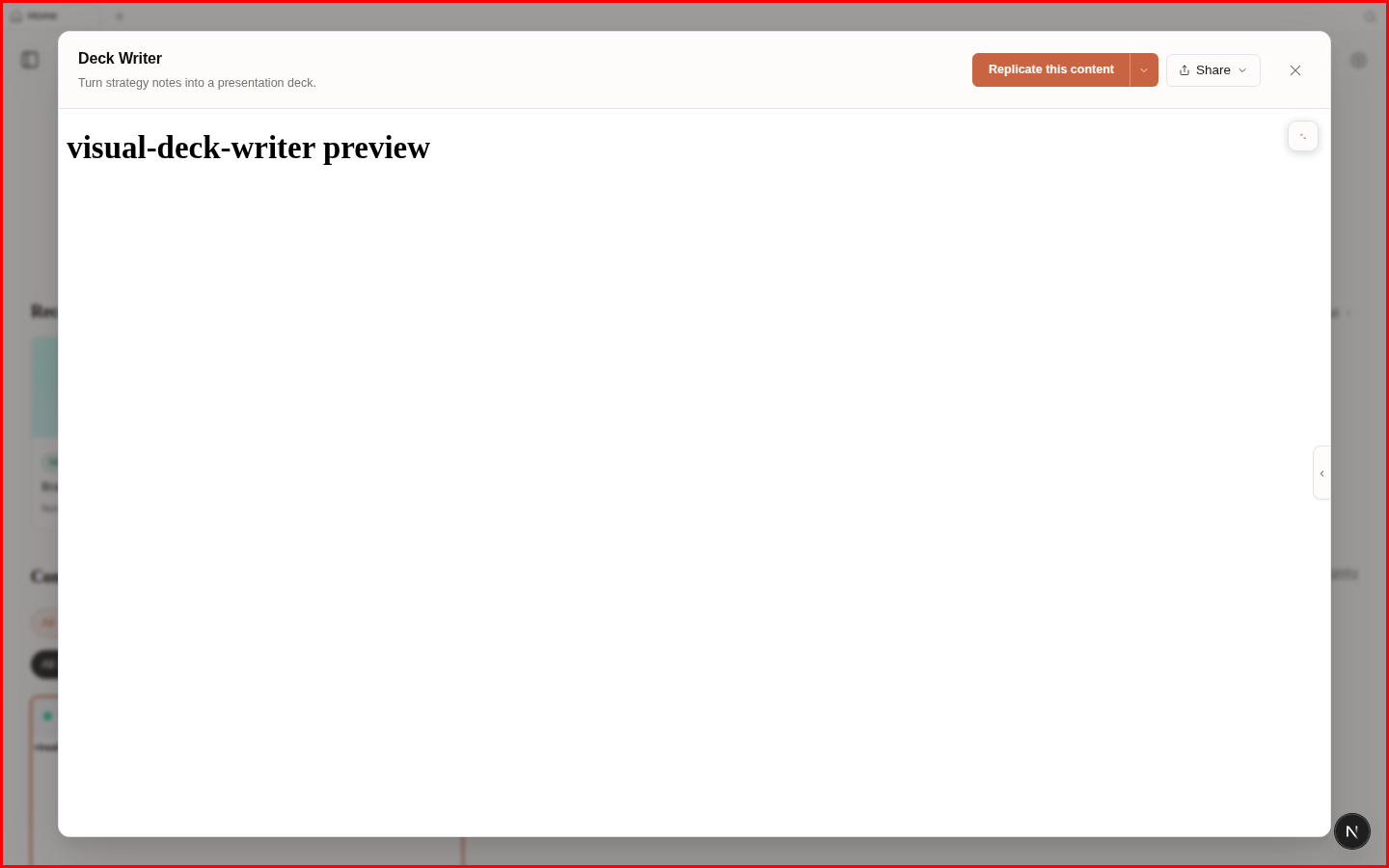
In this tabpreview close button used a hardcoded light background, so it did not adapt when the app switched to dark mode. That made it look like a bright chip floating over the preview content instead of part of the viewer chrome.This also made the control feel heavier than necessary and more likely to visually compete with page content underneath.
What users will see
In dark mode, the close button now uses theme colors, has clearer hover/focus/pressed states, and appears as a smaller, less intrusive control in the top-right corner.
Surface area
apps/weborapps/desktop(including Electron menu bar)odsubcommand or flag, newtools-dev/tools-packflag, or newOD_*env var/api/*endpoint, new SSE event, or changed shape inpackages/contractsskills/,design-systems/,design-templates, orcraft/Screenshots
before

after

Bug fix verification
No red spec; this is a visual styling bug. Verified that the existing preview DOM/layout is unchanged and the close control now uses theme tokens instead of hardcoded light colors.
Validation
pnpm --filter @open-design/web test -- FileViewer.test.tsxpnpm --filter @open-design/web typecheckpnpm guard